Atul’s Life Class
Picture making in drawing
Atul Vohora’s life classes went far beyond recording what you see. One of the key questions to think about and perhaps the most difficult to assess is that of picture making. What is it that you want to get a picture to convey and how do you make it interesting? DIfferent people have vastly different views on this and it often conflicts with issues of accuracy and ‘getting a likeness’. I subscribe to view that above all a picture has to work in its own terms as an abstract construction of marks, a challenging task in the life and portraiture world.
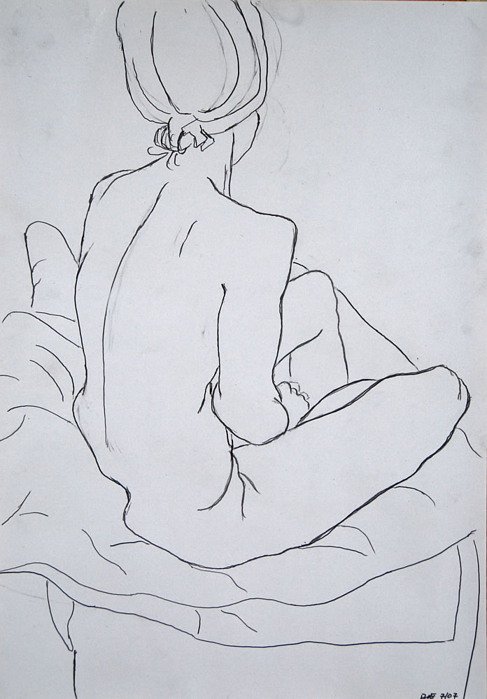
I fall into one way of drawing, one type of mark and one process, reflecting my comfort zone at that time. Yet it may be that different images and senses suggest very different approaches to the mark making because of the energy we want the piece to have. Compare the two line drawings on the right hand side, the subject was very similar, but the difference in the mark suggests very different things about the subject. At the bottom the clarity and flow of the mark suggests a grounded, reflective and present sitter. While the searching and almost jittery mark in the image above it almost suggests an anxiety a lack of certainty.
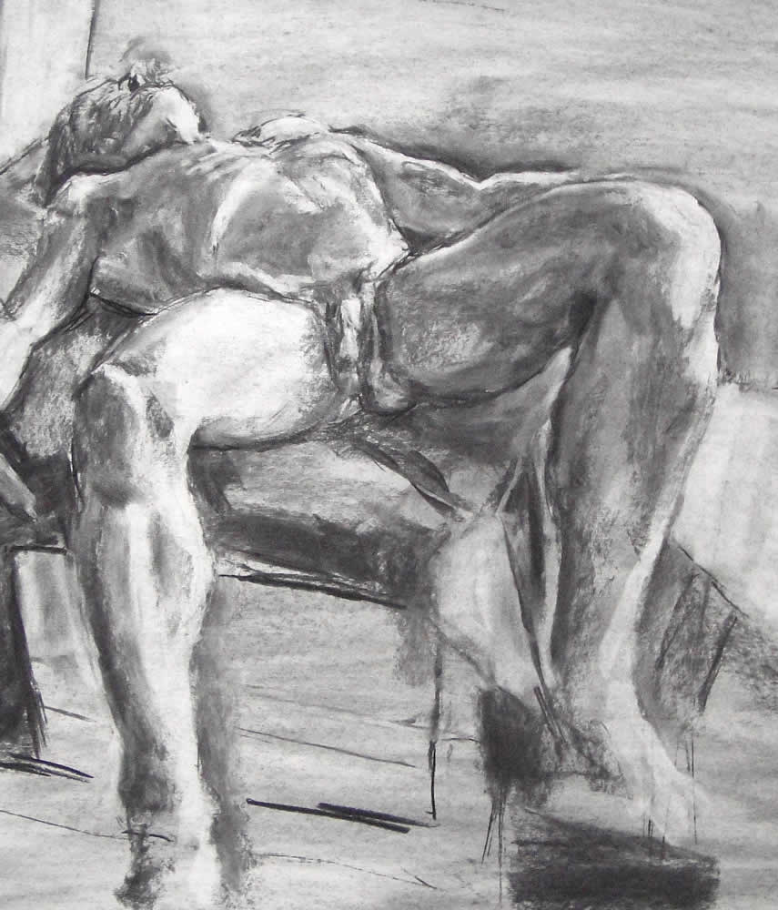
The two line drawings are very different from the tonal ones. The tonal pictures emphasize the thrust and physical form of the bodies, the flow of light running over them. In an abstract sense the rythm and juxtaposition of dark and light areas and the experience of how the eye moves through them. Whereas the line drawings are about the separation of space and lines which interrogate, where the ‘touch’ is a key part of the sense. The touch being both the pencil on paper and sense of flowing around the model.
The top picture illustrates the impact of marks that reinforce each other, the verticles above and below the table, sliced across by the table and in all contrasting with the flow and curves of the model. The rythms, the musical notes are clear and perhaps too ‘ordinary’. Whereas the top right star shape has energy driving from the center, increased by extending right to the edges of the paper, a consistent and essentially simpler image. In both of these the flow of the light over the body is key, how it draws the eye through the image. The difference in feel of the light, more flowing/feminine on the left and angular/masculine on the right.


