Fiona’s summer portrait
Questions of Intensity
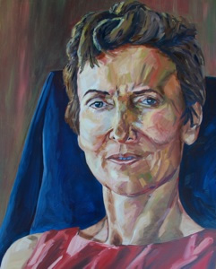
Here is a portrait of Fiona that I finally finished but it has been a struggle to get it right in the end. The main issue has been the organisation of intensity across the picture. (my apologies that the photograph of the picture is not that good). The idea was to show Fiona with an intense gaze, an invitation, perhaps a challenge, to the viewer to engage with her. I wanted to inject a sense of intensity into the picture as well as push the boundaries of my own mark making.
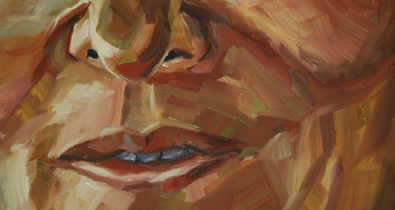
You can see in the detail picture above how I have used contrasting colours in the brush strokes to create a sense of drama, energy and form. Keeping clear brush marks also adds its own energy to the the image.
We are all used to the idea of creating interest with abstract patterns, as part of the picture making, using tone and colour management. However, I had not previously given much thought to the issue of patterning with intensity. I had intended that the chair back and wall would be as intense as the head, but experiencing that showed how deluded I was. It was way over the top. Having ‘knocked back’ all of the back ground by glazing over with the colour complement, the picture came to life.
It raises a potential for future paintings of creating more differentiation of intensity, even in the main subject, either through the colours loaded on the brush, (some less intense, with sparks of colour added). As well as the broader abstract picture impact of placing intensity. This should probably go hand in hand with the nature of the brush marks, ie intense marks versus blended out marks.

