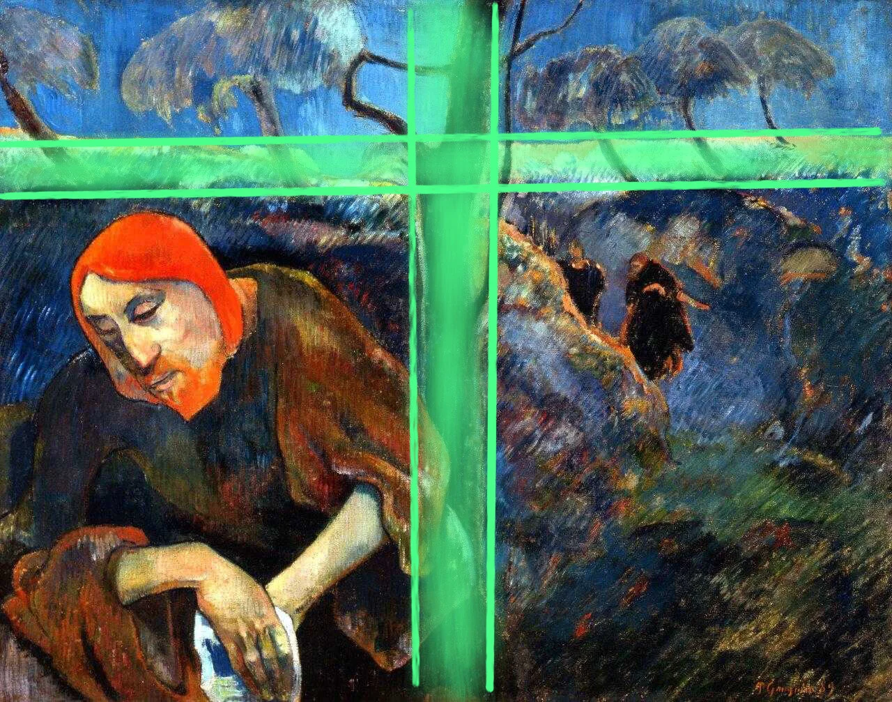
Christ on the Mount of Olives
Paul Gaugin - 1889 – National Gallery London
by Paul Gaugin
The National Gallery has an excellent exhibition, looking at the portraits of Paul Gaugin. Although Gaugin is not well known as a portrait artist, this exhibition challenges that perspective. One of the key paintings is Christ on the Mount of Olives. This painting is both a self portrait and a painting of Christ in the garden, shortly before being captured by soldiers. It is 4 centuries later that my previous blog post on the same pictorial theme, The Agony, and has some similar compositional devices.
The painting is dominated by a compositional cross made up of the central dark tree and the light that runs across near the top of the painting. These split the image into 4 sub images, each of which can be seen to stand on its own right and be different, especially the earthy and pain filled lower parts and the ethereal upper images, of heaven? The bottom left quadrant is an intimate portrait of Gaugin. Symbolically, Gaugin, saw himself as a saviour of art and was at this time being rejected by the artistic community in Paris, is seen slinking into the unknown, overshadowed by a dominant cross, on which he might be tortured.
In terms of energy, the image is held together by a web of 45 degree diagonals, running in both directions. The diagonals from top left to bottom right are the more obvious but the diagonals in the other direction are also supported by the brush marks, most of which are top right to bottom left. These give a coherence to the image and an almost geometric life. The dominant vertical and horizontal comes from the symbolic central cross, which is also supported by a few other and less obvious verticals and horizontals. In a sense, they anchor the lattice works of the diagonals.
There is a more detailed geometric life to the portrait of Gaugin/Christ, bringing more attention to it. But, the angles of geometry are completely parallel to those of all the other pictorial elements, ie 45 degree diagonals and few horizontals and verticals.
The colours in the picture are well balanced in a classical blue v orange. The major part of the paintings area is cool blues running the full range from light to dark. These are primarily balanced by orange/brown, in smaller areas, but the use of a very intense orange/red around his head and in small parts in the rest of the painting creates an overall balance. A little extra interest is injected by putting in some small amounts of not very intense green. It is easy to miss this, but it does add intensity to the overall image.
In overall compositional theme it is similar to one of my own paintings, Rock Face. A blue and orange/red composition, held together by a 45 degree lattice work as well as horizontals and verticals.


